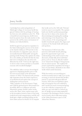
Designs for 3 page spread of Nick Knights work, second exercise for Typography Territory of Practice
Monday, 29 October 2012
Thursday, 25 October 2012
Runner!
Yesterday I worked on a runner for a short film set in a pub, it was a really interesting morning and I enjoyed making milk powder cocaine wraps and tea beer! I will hopefully be working on more shoots with the director Julie Bates in the future.
In the mind of Robert Crumb
For my second presentation of Robert Crumb I created a stop frame animation using illustrations on a whiteboard. I wanted to capture his obsession with women and sex in an illustrated form that can relate to his style. You can see the video at:
I am going to develop this by experimenting with more drawings and sequences. I think it works more effectively when the drawings become less literal.
Typography TOP
The first project for the typography territory of practise was to lay out the same piece of text in two different type faces. I used Garamond and Didot, I wanted to use both serif fonts but decided to use Didot for it's flat serifs to create a more modern feel and the curve of Garamond for a more classic tone. I'm so glad I'm finally being taught more about typography!
Wednesday, 17 October 2012
Love Camden
I am not writing for Love Camden! Love Camden is similar to time out so it's a great experience to get my writings out there:
http://www.lovecamden.org/rubbish-duck
http://www.lovecamden.org/its-ok-be-boring
http://www.lovecamden.org/rubbish-duck
http://www.lovecamden.org/its-ok-be-boring
I am here final film
For some reason I cannot get my final video to upload! Here's the link to the Vimeo page:
Sunday, 7 October 2012
Week One
 |
| Robert Crumb Self Portrait |
So year two has begun! It's been a fun week, we've been given two new projects and shown our I am here films, which I shall upload.
Peckham film project:
This week we were briefed on the Peckham film project. In groups of three, we our to create a documentary film on a business in Peckham. I have been teamed with Nathan and Matt. After looking around Peckham, we are keen to find a business that creates, not just sells. We like the theme of process for our film.
Biographies Project:
The next project we have been given is on biographies. Similar to the animated typography project last year, we chose names from a hat and will be creating presentations on what we discover about our subjects. I chose Robert Crumb, an American comic illustrator, artist and musician. So far I'm really enjoying reading his tales of LSD infused idea discovery and all about his childhood in a society controlled by mass media.
Subscribe to:
Comments (Atom)


