Monday 31 October 2011

Thursday 27 October 2011

Finally...

So this is the final idea for the logo, I've got to have an A3 page of developments and a final logo for tomorrow... the logo is all about pushing through all the crap and multiple ideas to find the best idea.

Tuesday 25 October 2011

Plan Z...ebra? No excuse, i got distracted!

A good image of our completed map 

Double Page Photoshop Project

Yesterday we were briefed on a new photoshop based project that we are taking part in in small groups. We are to design a double page spread on photoshop using photography involving the group members reacting with each other. It's exciting thinking about the possible outcomes, we can play with size and orientation of photographs to make a humorous outcome. Anyway, off to work on Plan Z...

Monday 24 October 2011

Plan Z

Thursday was the deadline for 100 logos, we all brought in our sheets and did some experimental group work on what the group decided were the three best logo designs. For example, one of my designs that was picked was based on 'Plan B' using the image of a cat. (based on the idea that many women choose cats as a plan B in life!) we then did some experimental work in how to display the ideas using different materials.
 

However i was still feeling unsatisfied with the choices made with my logos and was unsure how to develop them.

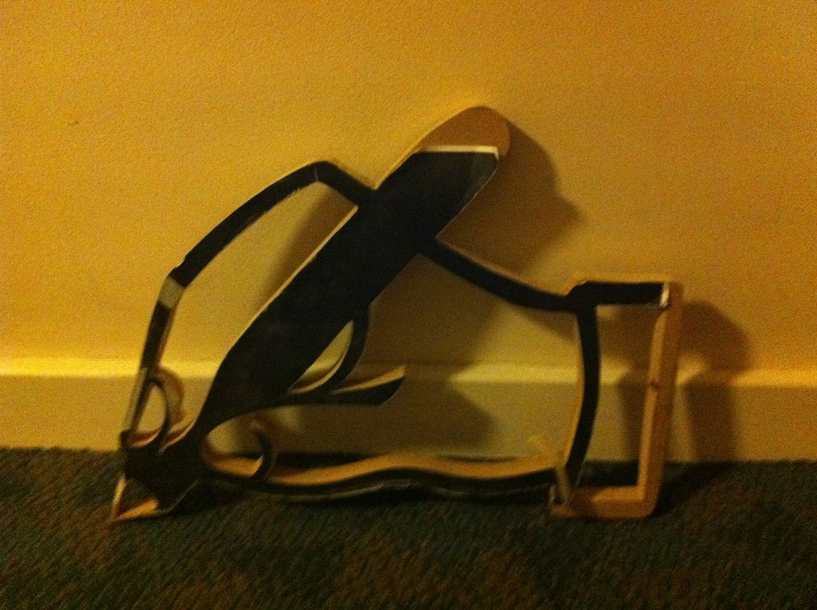
On friday afternoon we had a group critique with Nigel and Paul which was really helpful. They looked through all my ideas and developments and suggested that I focused on another idea I had had of 'Plan Z'. The idea behind plan Z is that plan B suggests that you only have two plans, while i believe that when designing you should have as many ideas as possible, so why not Z? Nigel had the idea that the Plan Z reminded him of a corny hollywood movie, so i had a look at some posters for a bit of inspiration.
 
I thought the dramatics of the posters could be a good angle to take with the use of plan Z and i'm going to experiment with displaying it in this way.


Also, had a little google, plan Z was the name given to the planned re-equipment and expansion of the Nazi German Navy, as ordered by Adolf Hitler in 1939... Hope that's not an issue!

Friday 21 October 2011

Iconic Photo Project

Muriel Finley circa 1920s
I've been given the go ahead to use the above photo as my iconic photo to re-stage for the photography project. It was taken by Alfred Cheney Johnston in the 1920s, Johnston was the main photographer of the Ziefeld Follies. I have put all my research for the this project on a separate page to keep it all together, have a look: RESEARCH

Wednesday 19 October 2011

Logos due tomorrow

100 logo designs
Here is my sheet of logo designs that are due in tomorrow, the ethos developed from 'Ideas are the foundation of great design' to 'Therefore you should always record them' to 'and always have a plan B'

Monday 17 October 2011

Late night research

Well, it's late night for me considering i usually find it difficult to function my brain post 9 o'clock. So had a look at the dreaded google for 1920 photography, and discovered photographs of Ziegfeld Follies girls from a photographer called Alfred Cheney Johnston. Ziegfeld Follies were a series of elaborate productions  in Broadway and New York in the early 1900s, involving glamourous showgirls, many of which appeared in Johnston's portrait style photographs, which are just so stunning, and ooze glamour. I discovered a video on you tube to show you some examples:
I plan on doing a little bit more research on the web before visiting the National portrait gallery to see the  'Glamour of the Gods - Hollywood portraits' exhibit for some inspiration and ideas, and then onto the library.

Brief brief brief

We were given our first individual assignment on friday, after being in groups and deciding on our 'Design ethos' we were assigned to create logos for our own personal design ethos. (100 by thursday!) After a group crit on thursday we will then develop the best designs and come up with our first logo design.
My 'ethos' is 'Good ideas are the basis of great design, therefore you should always record your ideas' (although that may develop with my designs!) I'm thinking along the lines of ways of recording ideas and symbolising that Ideas-->Design
The beginnings of some ideas (on the train)


We were briefed again today for a photography project that we will take part in in the next few weeks that sounds very exciting! Our task is to take an iconic portrait photograph from a period of time, and recreate it using ourselves. The period of time that I have been given is from the beginning of time-December 1929... Lots of research to do to find an iconic photograph!


Also, my Rob Ryan book came today! Will make some great bed time reading, just look at how incredible it is:

Wednesday 12 October 2011

So here's a preview of what we got up to today. First year Graphics BA took over the the banquet hall of Chelsea college, what an amazing room to be able to use! The project involved creating a map of the surrounding area for students, with important information to be displayed. We were put into groups and sent out to investigate certain areas of the world that surrounds us. We created this map, distorted to allow for the perspective, across the vast carpet from paper. It was a very complicated thing to work out! Although I think after adding in all the information, the final print will look rather good!

Monday 10 October 2011

the world of Zapf Dingbats

So today we were briefed on a typographic project that we are going to be working on over the next few weeks. What the project usually involves is creating a letter from MDF in a certain font (It's also great for an induction in the 3D workshop) and painting it white. Then the letter is documented in certain ways, for example Helvetica was 'disguarded' while Comic Sans was destroyed (only too rightly). For our project, instead of letters we have each been given a symbol designed by Hermann Zapf in 1977. What we are to do with it yet is undecided but I'm quite excited by this project, I've been given a great symbol to work with, despite how difficult it's going to be to cut! Looking forward to giving it a go:

My symbol

I want this hair...

I'm digging the Ariel look, although after being blonde for eight years I'm in no rush! Maybe Christmas time? Get a bit festive?

Also, I just ordered my copy of Rob Ryan's 'A sky full of Kindness'. For Those of you who don't know Rob Ryan (where've you been!) he creates the most beautiful fairy tale like laser cut screen prints:


I discovered an article in stylist magazine whist on the tube the other morning about the book which is described as a 'Charming fairy tale for adults', about two married birds. It wasn't just the story that originally attracted me to the book, it was the beautiful illustrations and the way that the type is integrated into the prints throughout, and now I am so excited to discover the story which is described as having a 'dark undercurrent'. You can read the article here and see Rob's blog (which is a lot more successful that this one so far!) here


Saturday 8 October 2011

And so it begins...

What an exciting start to the first year of Graphic Design! Our tutor has thrown us in to various group tasks to break the ice and get our creative juices flowing! So for the first project we were put into groups and given a method of communication to research and present - in the form of a song! (One issue was our lack of ability to sing!) Our group was given the subject of computers to investigate, our final piece was a rap battle between MC PC and DJ Mac. It got quite a few laughs and I think our use of computerised voices was rather fun:


Another project involved making a pair of glasses from black card and wearing them during our library induction, which was received well! I will add a photo of them all together soon.

Yesterday we were put into new groups and given a project based on paper. We were given a very large piece of paper and told to do something to it to get as much public interaction as possible. After a lot of contemplating over welcome mats and hop scotch, my group created a large target and took the piece to oxford street. In a four we held the piece of paper facing upwards and looked towards the sky, the curiosity of the people around was brilliant! We managed to get lots of people to look up, someone was even heard saying "I think someone's going to jump!" we documented the publics reactions with photos and videos:

Practising

Great reactions!


It really is amazing how you can get so much public interaction with a piece of paper!