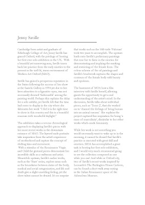
The first project for the typography territory of practise was to lay out the same piece of text in two different type faces. I used Garamond and Didot, I wanted to use both serif fonts but decided to use Didot for it's flat serifs to create a more modern feel and the curve of Garamond for a more classic tone. I'm so glad I'm finally being taught more about typography!


No comments:
Post a Comment