
Friday, 21 December 2012


Tuesday, 4 December 2012

Thursday, 29 November 2012
Consume Peckham

Poster for Consume Peckham
52 students. 18 businesses. 1 postcode.
Consume Peckham is proud to return to SE15 for the fourth year running, presenting the annual collaboration between graphic design students from Chelsea College of Art & Design and the Peckham community. The screening will showcase 18 short documentaries exploring the history, heritage and individual characters behind some of Peckhams’ longest running companies, as well as focusing on those businesses which are so integrated within the community that their stories ar
e often overlooked. After weeks spent gaining a first hand experience of Peckham’s atmosphere and inhabitants, the students hope to present a truly authentic depiction of one of London’s most socially and economically diverse areas. From the unseen processes of Everest Linen Services to the evocative patrons of Greenhive Care Home, each film conveys a subjective insight into the heart of South East London, as well as exploring the complex relationship between culture and commercialism.Consume Peckham is proud to return to SE15 for the fourth year running, presenting the annual collaboration between graphic design students from Chelsea College of Art & Design and the Peckham community. The screening will showcase 18 short documentaries exploring the history, heritage and individual characters behind some of Peckhams’ longest running companies, as well as focusing on those businesses which are so integrated within the community that their stories ar
Venue: Peckham Multiplex, 95a Rye Lane, SE15 4ST
Film Screening: 6.30 – 8.00
After Party Venue: Top Floor of Bussey Building, 133 Rye Lane, SE15 4ST
Time: 8.30 – Late
With Elliot Cranefield & WatchMePivot DJ’s
Wednesday, 28 November 2012
Devine Baskerville
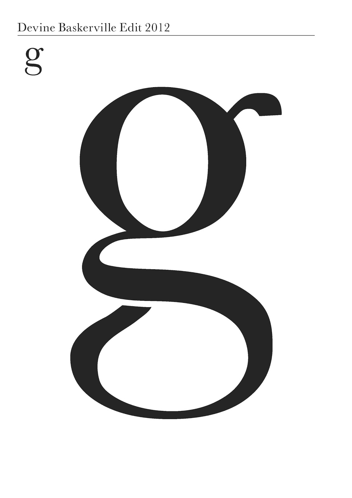

We were asked to create a new typeface for our typography territory of practice. I decided to edit an existing font, using illustrator and went for Baskerville as it's a font I seem to choose quite often. I played around with the anchor points and curves of the shapes to create something slightly different. I am keen to try and create something new from scratch for next week.
Thursday, 22 November 2012
Pencil to Pixel
Today I went to the Pencil to Pixel exhibition at Metropolitan Wharf (what a gorgeous building) Check out my review at : http://devinetalks.blogspot.co.uk/2012/11/pencil-to-pixel.html


Bad type made...better
For our typography TOP last week we were asked to find two really hideous fonts and typeset them to make them beautiful. Don't know how well this worked, but I was quite pleased with my typesetting! I chose a piece I wrote for a review of a fashion exhibition a few years ago, I decided to use fonts that were a juxtaposition to the genre of the text - Graffiti! So off I went to the old Dafont website and discovered the typefaces Most Wazted by Magique Fonts and Typographic Onedalism by Mans Greback...wow...just wow.


Tuesday, 20 November 2012
Contextual studies: Laughter is contagious
Proof that laughter is contagious: http://www.wimp.com/laughtercontagious/
This is what we want to prove in our contextual studies presentation. After lots of discussion we came to the conclusion that people are inclined to laugh over specific points that they find funny for personal reasons when brought up in conversation. I specifically was repetitively made to laugh by a Fawlty Towers reference of how Sybal makes toast in the morning, despite the fact that I had seen the joke numerous times over the years.
This is what we want to prove in our contextual studies presentation. After lots of discussion we came to the conclusion that people are inclined to laugh over specific points that they find funny for personal reasons when brought up in conversation. I specifically was repetitively made to laugh by a Fawlty Towers reference of how Sybal makes toast in the morning, despite the fact that I had seen the joke numerous times over the years.
Saturday, 17 November 2012
Boombox

A new boombox illustration drawn for for my sister for a christmas hoody. My prints are now available on tote bags on society6:http://society6.com/sophiedevine/Owl-wN0_Bag
Wednesday, 7 November 2012
Contextual Studies : British Humour
With two Americans, a Brazilian, an Indian and two british members, british humour is something that our contextual studies group found interesting to discuss. There are many aspects of british humour that make it unique. It is often said that foreigners struggle to understand when we are being ironic and sarcastic, which is something I find comes to me naturally in everyday life, which is why this is the aspect of British humour that I want to investigate further. From my searching the internet and library catalogue I've discovered it's quite hard to find examples of people using sarcasm when it's something that comes quite naturally to us in everyday life, so lots of watching of comedies for me! So i leave you with something to illustrate the absurdity that British humour sometimes encompasses, the Knights who say "Ni!"
Monday, 29 October 2012
Nick Knight Type
Designs for 3 page spread of Nick Knights work, second exercise for Typography Territory of Practice


Thursday, 25 October 2012
Runner!
Yesterday I worked on a runner for a short film set in a pub, it was a really interesting morning and I enjoyed making milk powder cocaine wraps and tea beer! I will hopefully be working on more shoots with the director Julie Bates in the future.


In the mind of Robert Crumb
For my second presentation of Robert Crumb I created a stop frame animation using illustrations on a whiteboard. I wanted to capture his obsession with women and sex in an illustrated form that can relate to his style. You can see the video at:
I am going to develop this by experimenting with more drawings and sequences. I think it works more effectively when the drawings become less literal.
Typography TOP
The first project for the typography territory of practise was to lay out the same piece of text in two different type faces. I used Garamond and Didot, I wanted to use both serif fonts but decided to use Didot for it's flat serifs to create a more modern feel and the curve of Garamond for a more classic tone. I'm so glad I'm finally being taught more about typography!


Wednesday, 17 October 2012
Love Camden
I am not writing for Love Camden! Love Camden is similar to time out so it's a great experience to get my writings out there:
http://www.lovecamden.org/rubbish-duck
http://www.lovecamden.org/its-ok-be-boring
http://www.lovecamden.org/rubbish-duck
http://www.lovecamden.org/its-ok-be-boring
I am here final film
For some reason I cannot get my final video to upload! Here's the link to the Vimeo page:
Sunday, 7 October 2012
Week One
 |
| Robert Crumb Self Portrait |
So year two has begun! It's been a fun week, we've been given two new projects and shown our I am here films, which I shall upload.
Peckham film project:
This week we were briefed on the Peckham film project. In groups of three, we our to create a documentary film on a business in Peckham. I have been teamed with Nathan and Matt. After looking around Peckham, we are keen to find a business that creates, not just sells. We like the theme of process for our film.


Biographies Project:
The next project we have been given is on biographies. Similar to the animated typography project last year, we chose names from a hat and will be creating presentations on what we discover about our subjects. I chose Robert Crumb, an American comic illustrator, artist and musician. So far I'm really enjoying reading his tales of LSD infused idea discovery and all about his childhood in a society controlled by mass media.

Tuesday, 18 September 2012
I am here
 |
| People watching |
Tuesday, 11 September 2012
I am here
And so it begins, a new project ready for the beginning of year 2 in October! Scary stuff...
We have been asked to prepare a digital presentation for the first week with the title 'I am here', this can be about anything so I must come up with a good idea! Ideally I would like to create a film/animation as I'd like to explore this media more but all the equipment I have is an Iphone, which could be fun. I had the brief idea of creating something about what you can find out about me through my Iphone as it embodies everything I do. Lots to think about... need to get the brain pumping!
We have been asked to prepare a digital presentation for the first week with the title 'I am here', this can be about anything so I must come up with a good idea! Ideally I would like to create a film/animation as I'd like to explore this media more but all the equipment I have is an Iphone, which could be fun. I had the brief idea of creating something about what you can find out about me through my Iphone as it embodies everything I do. Lots to think about... need to get the brain pumping!
 |
| I am here |
Monday, 10 September 2012
Pub Art School
This summer I have been working on some imagery and illustration for Pub Art School for Shirley Williams to use on flyers etc for her business. Here are some of the images:


Tuesday, 29 May 2012

Monday, 21 May 2012


Monday, 14 May 2012
Wild is the Wind
So I've been working with the album cover, adding typography etc. I had a tutorial with Peter today and it looks like it's going well, all thats left to do is mess around a bit more with the type. The designs I came up with for the back cover were much to messy, it's time to start working to scale! Here's a peek at some of the designs I showed today:


Monday, 7 May 2012
Friday, 4 May 2012
Tuesday, 1 May 2012

Self Portrait
I finally completed the self portrait I started weeks ago, not too keen on it but I thought I'd post it as it took a while!


Headhunters
Last week for our film project we went to watch the film Headhunters at a cinema in Soho. It was a really good film with a twisted plot, I would definitely recommend it! We were then given the task to recreate the film in a one minute film of our own, not easy I can tell you! We had an hour to plan, an hour to shoot and an hour to post product. I can tell you it definitely took a lot longer than that! It was really fun to play around with the camera using different shots and experimenting with imovie.
Beauty in the Making

Last week I went to the Beauty in the Making event at Victoria House, the exhibition was set up by GF Smith and allowed us to get an insight behind the scenes at paper making and print. It was a really interesting exhibition, beautifully created with the use of stacks of paper, also I got lots of free promotion print items which are really interesting! We had the opportunity to make our own envelopes and do some letterpress printing as well as seeing how paper is actually made.
Wild is the wind update
So it must have been two weeks since I posted about my LP Cover, Sorry folks, I really am rubbish. So last week I brought in some more experiments I had done:


Peter and I agreed that the image of the orange birds wings from the week before looked a lot more successful so I decided to take a step back and work on that imagery. Then this week I experimented with different ways that a LP cover could open to display the wings. This method was an agreed favourite, I discovered this folding method through a piece I received from an exhibition. The way it works involves the card being able to fold outwards in three ways, it took me a long time to work out how to do it! I'm afraid I don't know the name of the fold.


So my next step is to work on typography layout etc, something that I really don't know enough about!!
Subscribe to:
Comments (Atom)